The announcement of the title of Sony's next web-slinging film - Spider-Man: Homecoming - and its logo has got tongues wagging, with the general consensus being that it looks like something made in Word Art.
Join us on a journey, starting in 2002, to find out whether the Tom Holland-starring film's logo really is the worst to crawl across our screens...
Spider-Man (2002)

Unmemorable. We don't think the trident-like 'm' has any significance.
Spider-Man 2 (2004)

Unmemorable, but with a red background.
Spider-Man 3 (2007)

Rinse and repeat, with added italics. (It was Spider-Man 3. Everyone had given up by that point.)
The Amazing Spider-Man (2012)
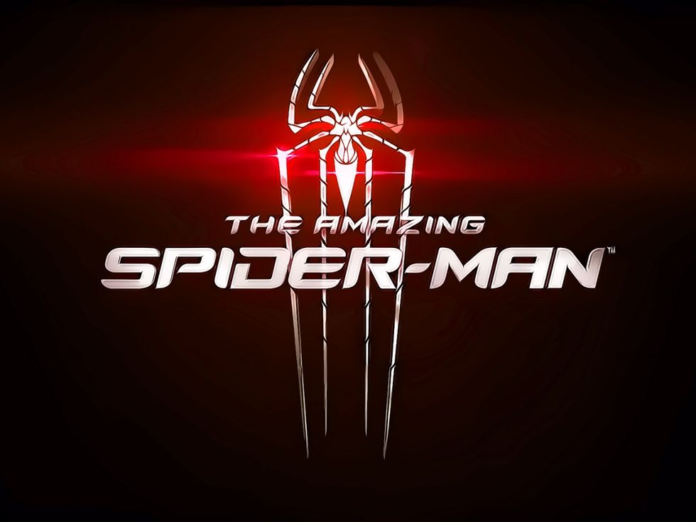

The spider symbol makes this the first logo to actually look like it belongs to Spider-Man - although JJ Abrams called and asked for his lens flare back.
What to Read Next
The Amazing Spider-Man 2 (2014)

Bring back the spider!
Spider-Man: Homecoming (2017)


It's got some comic book-style personality, and that little Marvel logo is a beacon of hope.
Even if it was made in MS Word.


